Work is busy – life is crazy – and my dog is at DAYCARE (Ill give you the low down on Friday) haha!
Needless to say I am only popping in quickly to show you one (out of 4) of the pieces I finished for a client.
She insisted on bright colors. Teal was definitely the way to go.
If it were me the bottom would have a dark stain on it giving it a more distressed look but that would in turn tone down the brightness of the blue that she really wanted.
No stain was the way to go
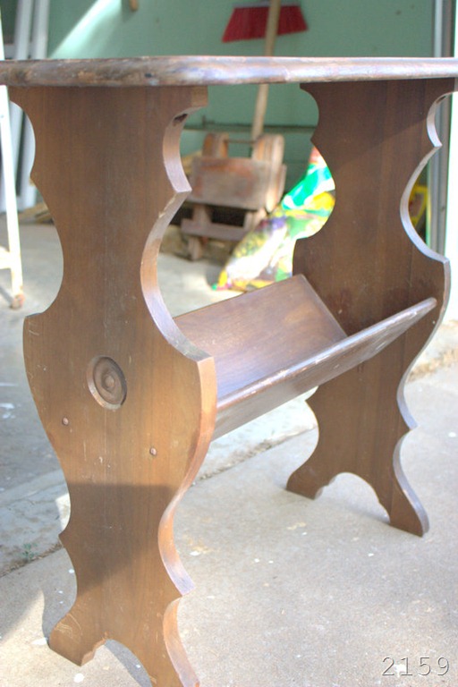
The table was in decent shape. Nothing a good sanding and painting couldn’t fix. I love the lines on the top of the table – very curvy and feminine.
The teal/blue is bright but pulling a bit brighter in these pictures. Its more of a soft teal than a crayon ocean blue.
So what do you think? Pretty good transformation if I do say so myself…
I would have liked to see it a bit more distressed – like I said earlier about the stain – but I think this will be right up her alley.
I think I range all over the board when it comes to glossy and crisp vs distressed and aged..
Where do you fall? More of a black glossy type décor or rustic and distressed?


i think i'm more of a rustic distressed type. although, anything you seem to transform i love!!!
ReplyDeleteThanks Averi! I like the imperfections of distressed a lot - easier on the painter ;)
Delete